


Welcome to Higher Purpose Hub™ brand assets online. This is where you can download our logos, read our guidelines and connect with us regarding questions about our brand visuals.
Before you download the Higher Purpose Hub™ assets, please be sure to read our full brand guide. We promise, it's not a long read. It gives a rundown of how to place and treat our assets. Below, peruse through an abbreviated version of guidelines for our main, Higher Purpose Hub™ logo. If you're already working with us and need some additional brand resources, click here.
OFFICIAL LOGO
In some cases, a black or solid colored background may not be needed as long as the logo shows clearly and legibly. Strictly adhere to the brand guide about not adjusting or moving any part of the logo unit out of its position.

ALTERNATE COLORS
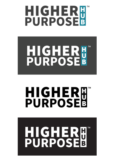
The reversed two color option can be used as an alternate version, depending on where and how it’s used. However, the black and white options are the alternate versions when needed in one color.
LOGO COLORS
Take note of the Pantone, CMYK, RGB and HEX (for web).

R - 32 • G - 135 • B - 154
C - 82 • M - 33 • Y - 33 • K - 3
HEX - #20879a

R - 65 • G - 65 • B - 65
C - 67 • M - 60 • Y - 59 • K - 46
HEX - #414141
SPACING
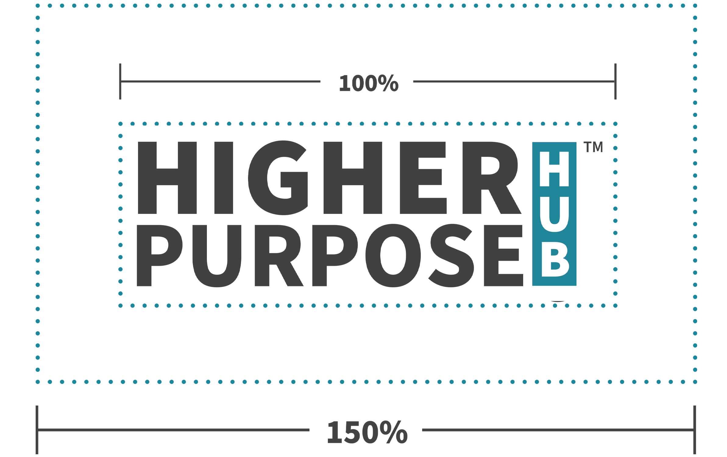
Be sure to give the Higher Purpose Hub™ primary, program and event logos appropriate spacing.
- The empty space around the logo should be at least
150% of the width of the logo. - Don’t go any smaller than 16 pixels wide.
DO'S
In order to maintain consistency, please take note of what is acceptable.
This logo is one unit and should NOT be broken apart.
- DO Shrink down the logo in proportion when appropriate.
Give appropriate spacing when placing the Higher Purpose Hub logos
(See spacing) - DO Use the recommended one color black or white logo when appropriate.
(See alternate color versions)
DONT'S
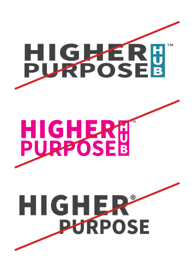
In order to maintain consistency, please take note of what is not acceptable. This logo is one unit and should NOT be broken apart.
- DON’T Stretch or skew the logo out of proportion or break it apart.
- DON’T Change the colors to anything other than the palette colors or recommended black/white versions.
MERCHANDISE
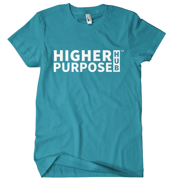
The primary logo or one color versions are ideal for printing on promotional items. The recommended black or white color should be used on different background colors and background texture combinations.
For merchandise such as t-shirts, bags, cups, etc., a minimal color palette is recommended for printing. For layout options, it’s best to remain simple with a centered graphic.
In regards to placement: Any layout other than a simple one, should be consulted by the Higher Purpose Hub Creative Team.
USAGE & APPLICATION
Even though some examples are not seen here, these are some things not to do with the logo when in use & application:
- Do not place the logo on a background (photo, colored or textured) that lessens the visibility of the logo
- Do not use inappropriate drop-shadows on the logo that hinder the color scheme or lessen visibility
- Be conscious of how the logo is treated when placed with other logos. Make sure there is appropriate spacing between the Higher Purpose Hub™ logos

LOGO DOWNLOADS
Higher Purpose Hub Logo™
Higher Purpose Fest Logo™
Higher Purpose Center Logo™
Higher Purpose Network™
Higher Purpose Awards™
Money Purpose Success™
Higher Purpose Stories™
Higher Purpose Films™